

As of early 2024, mobile traffic makes 53% of web traffic worldwide, and its share is expected to grow.
At the same time, global conversion rates from mobile devices are significantly lower than desktop (1.32% vs 3.99%).
In light of these figures, Ecommerce managers must optimize their online store to be ‘mobile first’.
This article suggests some best practices to improve mobile UX, and increase CVR.
Disclaimer: Always test changes and monitor their impact. It’s best practice to roll out UX changes gradually.
Avoid Annoying Distractions
Avoid ad-like content or pop-ups larger than 20% of the screen.
According to Statista, 67% of German users mentioned pop-ups as the most annoying part of shopping online.
Pop-ups often interrupt user journeys and potentially hide important elements of a page (except for cookie notifications).
For important communication try to use inline elements that you can close, and don’t obscure other important elements.
You can still show your Email pop-ups, but incorporate them more naturally into your pages, e.g. by making them smaller.
Scrolling And Navigation
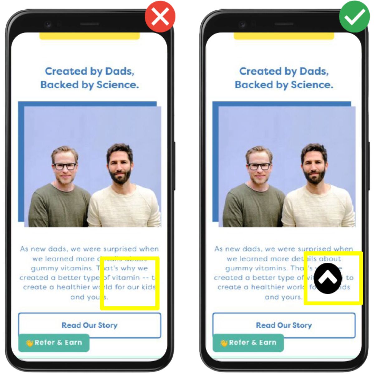
Implement A ‘Scroll To Top’ Button On Lengthy Pages
As mobile screens are smaller, they take much longer to scroll. This can be annoying when users need to scroll back.
Adding a ‘scroll to top’ button can simplify this and save users’ thumbs some effort.
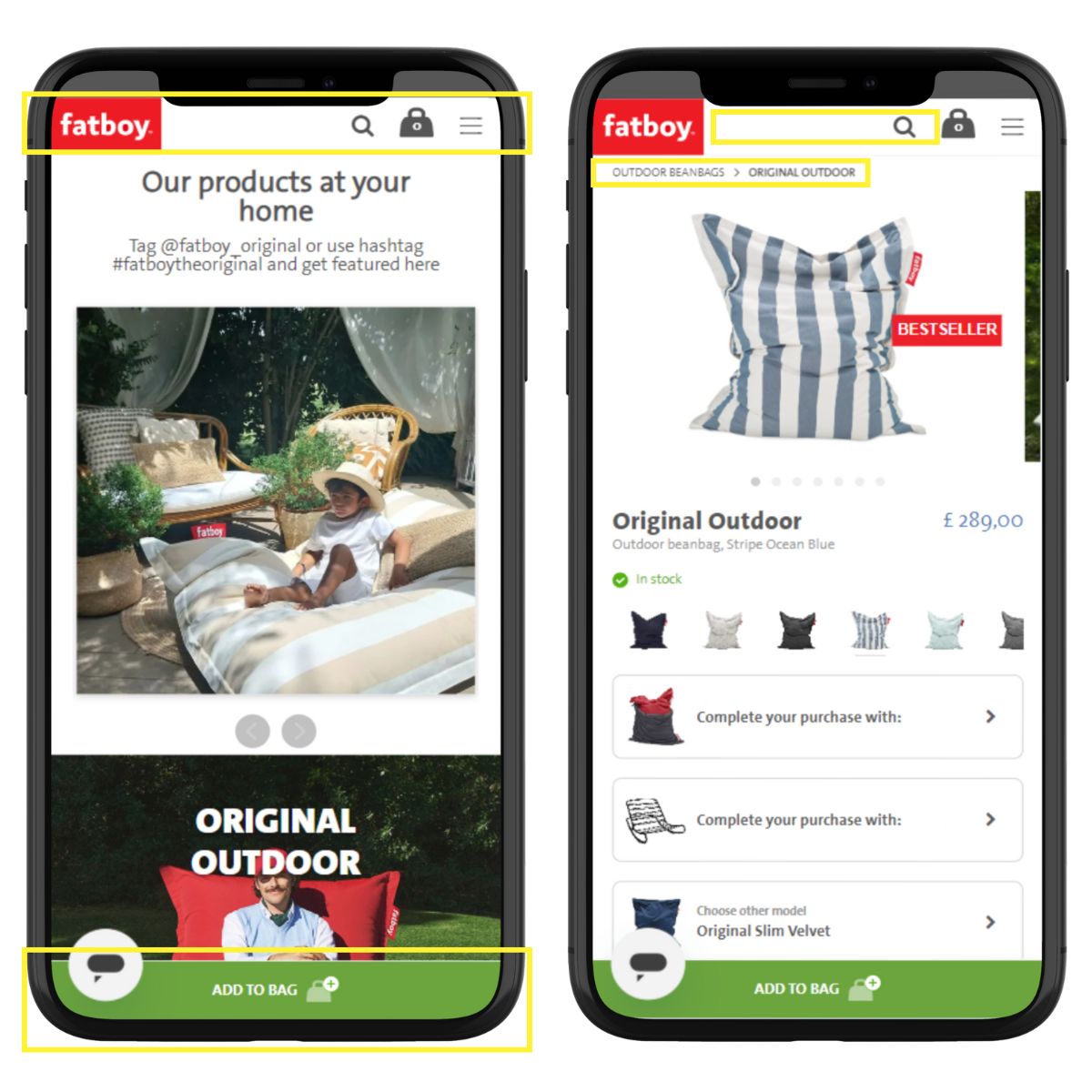
Add A Sticky Navigation Bar & Add-To-Cart Buttons
Another easy way to save users some scrolling is to add a sticky navigation bar. This means, keeping it visible at all times.
Alongside the top navigation bar, which includes your logo, burger menu, and search function, you can keep the add to cart button fixed to the bottom of the page.
This way, users can add products to their cart, after reading the full information on your PDPs.
Add Search Functionality To Your Navigation Bar
Some users find what they’re looking for in your online store quickly, while others take longer to browse.
Many like to use the search option to look for specific products in your online store. And users who use the search box often show higher conversion rates.
So make sure the search function is also visible in your mobile navigation bar, not only for desktop users.
Simplify Backwards Navigation With Breadcrumbs
Backward navigation can be a pain on mobile devices. Adding breadcrumbs simplifies and makes this option visible.
It also gives users who landed from a Google Shopping ad the opportunity to discover other products that might be relevant to them.
Google also considers breadcrumbs as a good UX factor for SEO.
Make Your Mobile Site Accessible To Everyone
Use A Font Size Of At Least 16px Or 12pt
As mobile screens are small, many online stores try to pack in as much content as possible by using small fonts.
However, too small texts that don’t meet accessibility standards are hard to read, and frustrate many users.
Google’s design guidelines recommend a minimum font size of 16px, or 12pt. This should allow easy reading when the phone is held at a natural distance.
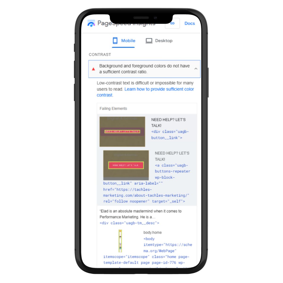
Ensure Sufficient Color Contrast
Low color contrast can cause issues for users with impaired vision, and users using devices in direct sunlight.
You can use Google’s PageSpeed Insights (Lighthouse) to see how your site performs on that aspect.
This one can be tricky due to brand CI, but should be considered nevertheless.
Include Alternate Text For Images
Image alt text serves 2 roles: it helps users with poor vision to understand the content of an image, and it also tells Google what’s on it.
So adding alt text to all images on your site is important for making your site more accessible.
It can also help you generate some organic traffic through image search.
Ensure Buttons And Other Elements Have Names And Labels
Similar to missing alt tags, this is also crucial for users with poor vision.
According to a UK survey from 2016, 71% of disabled customers with access needs will click away from a website that they find difficult to use.
Show Your Value Proposition Above The Fold
Unique Value Proposition Above The Fold
Your value proposition will determine if users will continue exploring your products.
The better it is, and the more it sets you apart from the competition, the higher the chances of converting users into customers.
Ensure that it’s clearly visible above the fold on your mobile site. It can be in the announcement bar or on your main hero banner.
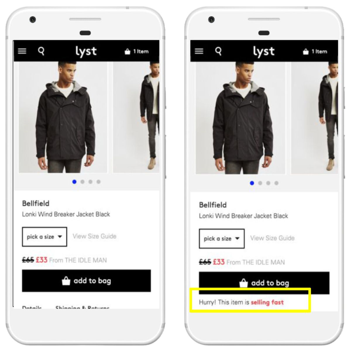
Add Urgency
When you run a promotion, add urgency elements to it to increase CVR.
The most common way is by stating when the offer will expire with a countdown timer.
Other examples: ‘Order now to get it by Xmas’, or ‘Only 2 products left’.
Of course, this recommendation is relevant for all device types. Just need to make sure all urgency elements are visible on mobile.
Reduce Friction During Checkout
Display The Correct Keyboard For Each Form Field
This one might sound small, but it’s at a sensitive stage of the customer journey.
21% of users abandon checkout due to too long or complicated checkout process, and mobile checkout UX tends to be even less convenient.
When a user clicks on a form field, show them the relevant keyboard. This means, automatically showing text keyboard for a customer’s name, and the numbers keyboard for zip code and card number.
Ignoring the context of input fields can result in users having an extra step.
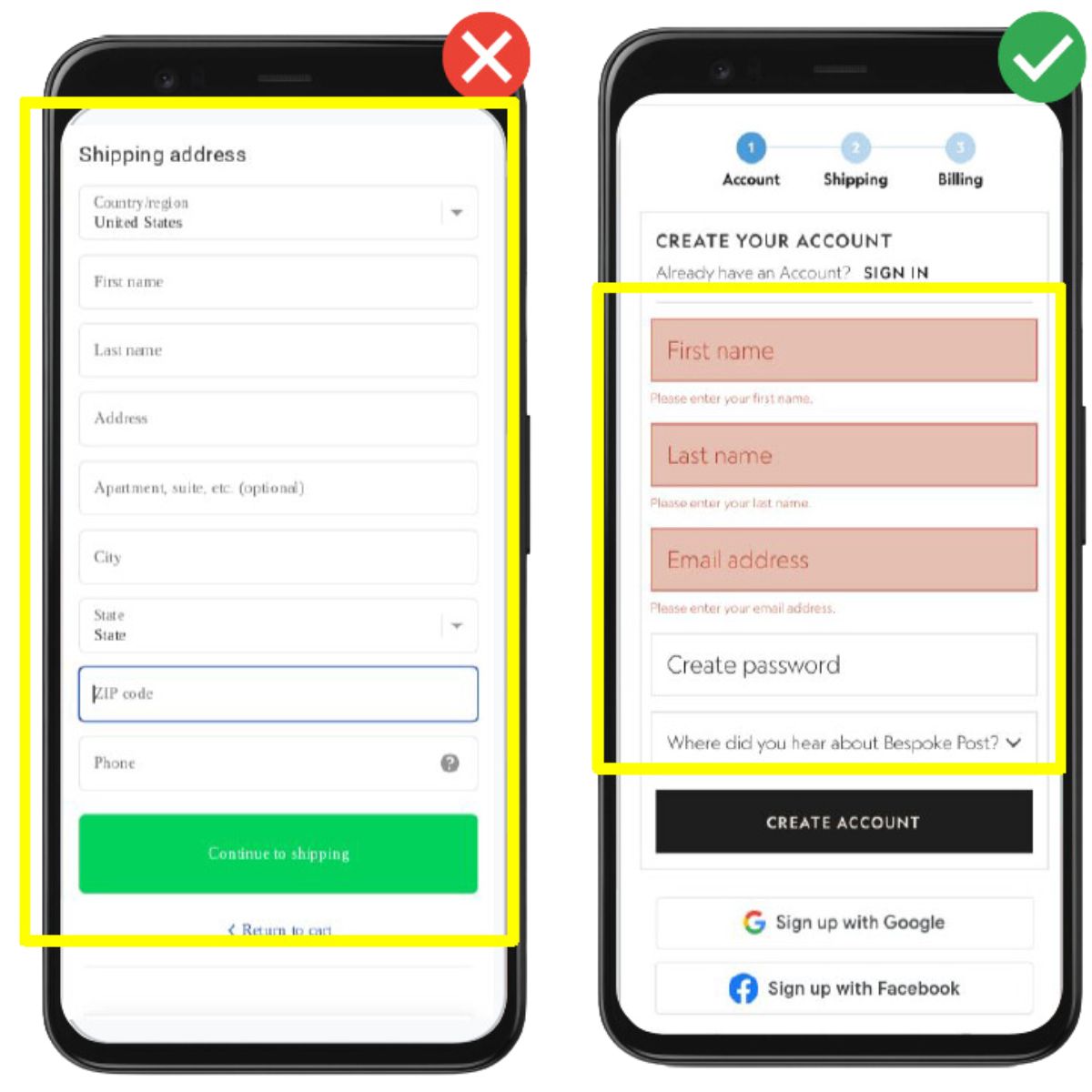
Implement In-Line Error Validation
You probably know the feeling of detecting errors in the form only after submitting it. It can be frustrating.
Instant validation of each form field, while users fill in their details, can save that friction and increase your mobile conversion rate.
Use A/B Testing To Increase Mobile CVR
Prioritize A/B Testing Mobile UX Elements
A/B testing different elements on your website can expose valuable wins. Sometimes small tweaks that seem negligible can increase conversion rates by 10%, even 20%.
Ecommerce website managers should plan an A/B testing roadmap for every page type – home, PLPs, PDPs, cart, and checkout.
The tested elements should be prioritized by their potential, considering the required investment (developer time).
Conclusion
As the traffic share from mobile devices continues to increase, and given the lower mobile conversion rates, a mobile-first approach is crucial for online stores that wish to thrive.
By continuously A/B testing different elements, Ecommerce brands can increase mobile conversion rates significantly, and with them their profitability.
Further Reading
- How To Build High-Converting Product Detail Pages on Shopify
- How To Increase Conversion Rate On Shopify
- Boosting Online Sales with Social Proof: A Shopify Store Owner’s Guide
- Can YouTube Ads Drive Ecommerce Sales?
- 8 Ways to Scale Performance Max Campaigns For ECommerce
- Examples of Using ChatGPT for Google Ads