For any online store owner, the product detail page is a critical component that plays a significant role in the success of their e-commerce business. Also known as E-commerce PDPs, optimized product detail pages can significantly boost conversion rates and overall sales.
This article will guide you on how to build high-converting product landing pages on Shopify.
- Product Detail Page Design Basics
- Product Title
- Price
- High-quality Images and Videos
- Variant selectors (size, color, design, bundle)
- Quantity selectors
- Short Description
- Shipping And Returns
- Unique Selling Propositions (USPs)
- A Prominent Add-to-Cart Button
- Establish Trust with Social Proof
- Cross-Selling Products
- And Don’t Forget SEO
- Designing Your Product Detail Page
- Product Page Examples
- Testing and Product Page Optimization
- Conclusion
- Further Reading
Product Detail Page Design Basics
Product detail pages are the individual pages for each product you sell on your Shopify store. They play a crucial role in informing visitors about the product and persuading them to make a purchase. Key components of a successful product detail page include:
- Product Title
- Price
- High-quality images and videos
- Variant selectors (size, color, design)
- Quantity selectors
- Short description
- Shipping and returns
- USPs
- A prominent add-to-cart button
- Social proof
- Cross-selling products
Let’s discuss shortly each of these elements.
Product Title
The product title is one of the most critical elements of a product page. It’s the first thing customers see when they land on the page.
Price
The price of the product is another crucial element. It should be displayed so that customers can easily see it.
If the product is discounted, make sure that the discount is highlighted, e.g. by using strike-through prices or % discounts.
It’s also important to include any discounts or deals that are currently available. If there are different pricing options, such as a reduced price for buying in bulk, these should also be stand out.
Prices such as $9.99 are perceived as cheaper vs. full amounts such as $10. Use this logic to increase conversion rate.
High-quality Images and Videos
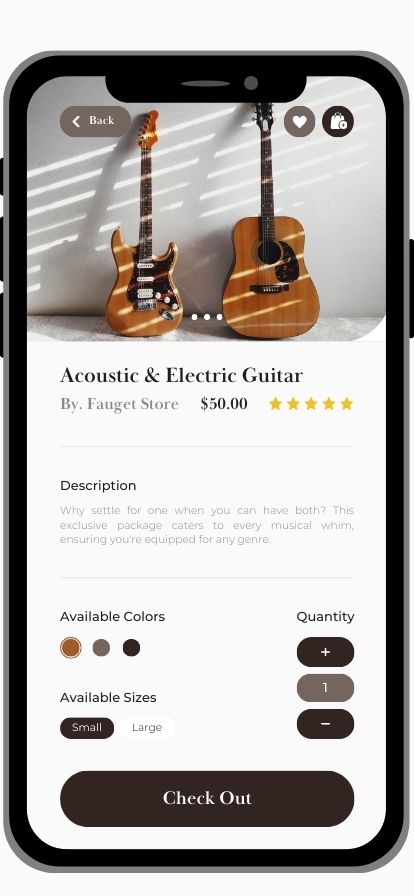
High-quality images and videos are essential for showcasing the product. They give customers a better understanding of the product’s features, how it looks, and how it functions.
Multiple images from different angles, close-ups of important features, and videos demonstrating the product in use can significantly enhance the customer’s shopping experience.
If relevant, you can also include some of the product’s attributes and USPs on the product images.

Variant selectors (size, color, design, bundle)
If you sell T-shirts, you probably offer different colors and sizes for each model. You may also offer bundles to increase average order value (AOV), e.g. sell 3 T-shirt packs for a lower price per unit.
Make sure that your customers can see all relevant variants and easily toggle between them.
Quantity selectors
For most product types it makes sense to include a quantity selector as well. Think about socks, coffee mugs, chairs, etc. If you’re selling heavy furniture like sofas, this feature is less important.
Short Description
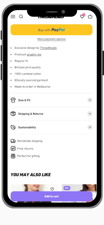
The short description provides a quick overview of the product. It should highlight the key features of the product and its benefits. The description should be easy to read and understand, using bullet points.
A longer description can come lower down the page.

Shipping And Returns
A very important element in my opinion. People want to know how much shipping will cost them, when they’ll receive their order, and what to do in case they’d like to return it.
On product pages, this should be short and sweet. More details can be offered on a dedicated ‘shipping and returns’ page.
Failing to communicate your shipping policy transparently can impact conversion rates negatively.
Unique Selling Propositions (USPs)
If the title, images, and description tell potential customers WHAT you offer, your USPs tell them WHY they should buy it from you.
Unique Selling Points are the unique qualities or benefits that set the product apart from its competitors. They can be anything from superior quality, innovative design, environmental friendliness, or exceptional customer service.
By highlighting these USPs (preferably with icons), businesses can convince customers that their product is the best choice.
A Prominent Add-to-Cart Button
A prominent add-to-cart button is a must-have on a product page. It should be easy to find and use, encouraging customers to proceed with their purchase. The button should stand out from the rest of the page, usually through contrasting colors or larger size.
Ideally, this button should be above the fold, or close enough to it. Many Shopify stores use a ‘sticky’ add-to-cart button at the bottom of their mobile PDPs, meaning that the button is always visible, never being too low or too high for any user to find.
Establish Trust with Social Proof
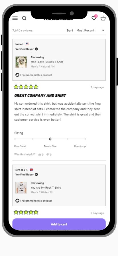
Customer reviews are a powerful tool for building social proof, trust, and credibility.
They provide real-life experiences of people who have used the product, helping potential customers make an informed decision.
Positive reviews can significantly influence a customer’s decision to purchase, while negative reviews provide valuable feedback for the business to improve its products or services.
On your Shopify product pages, you can use social proof as star reviews directly near the product title, in a review section, highlight selected reviews in a testimonial section, or include UGC from your social accounts to show your products in ‘real life’ with happy customers.
I’d recommend using the Judge.me or Loox reviews apps that come with great features.
Another way to increase social proof is to include it as one of your USPs, e.g. ‘More than 10,000 people already purchased’. And of your brand was mentioned in any known magazines or won any tests, make sure to communicate that too.

Cross-Selling Products
Many potential customers will land on your PDPs from Google Shopping or Meta catalog campaigns. If they don’t like your product, and you don’t provide an alternative, they’ll bounce.
Cross-selling products carousels are other products that the business recommends based on the current product the customer is viewing. They can be complementary products, accessories, or products that other customers have bought together with the current product.
Cross-selling can save a lot of your traffic from bouncing, enhance the customer’s shopping experience by suggesting additional relevant products, and increase the average order value (AOV).
Limespot is one of the most popular cross-selling apps among Shopify merchants.
And Don’t Forget SEO
To help more potential customers discover your optimized product pages organically on Google, make sure not to forget SEO. Ensure that your URL, meta title, and meta description are informative and include relevant terms such as the product type and its attributes (colors, size, material, style).
Images should also be optimized for SEO with alt-tags and proper file sizes (Shopify does compress images for better site speed, but don’t push it).
Good SEO can help to improve the profitability of your business significantly.
Designing Your Product Detail Page
Designing an effective product detail page requires understanding visual hierarchy and design principles. The layout should guide the visitor’s eye towards the call-to-action ‘Add To Cart’ / ‘Buy Now’.
With the growing share of mobile traffic, it’s essential to design mobile-friendly product detail pages. Key elements should be placed above the fold for immediate visibility.
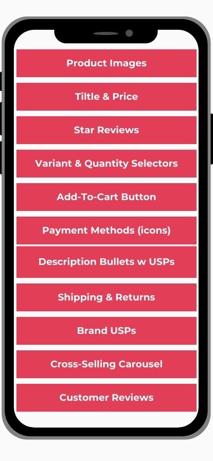
Here’s the template I usually suggest for my clients, from top to bottom (mobile):

Product Page Examples
Here are a few Ecommerce PDPs I find very good:
- Threadheads (T-shirts) – super user-friendly, clean UI. Keeping it simple is the best way to go!
- Purelei (jewelry) – also here, they focus on the images and the functional features (e.g. variant selector, payment methods), keeping away from lengthy descriptions.
- Zalando (fashion) – The biggest fashion website in Europe for a reason. Super smooth UI with all important features included, including a size finder.
- TRIGGERDINGER (physiotherapy products, German) – These guys did an amazing job explaining their novel products with images, videos, USPs, and reviews
Testing and Product Page Optimization
A/B testing is a valuable tool for optimizing your product detail pages. Test different elements such as product descriptions, images, and CTAs to find out what converts best.
You can also add or remove elements, or rearrange existing ones in your UI (User Interface).
Use analytics tools such as Google Analytics, Microsoft Clarity, and advertising platforms such as Google and Meta to track page performance and apply customer feedback for continuous improvement.
There are Shopify apps that can help you with A/B testing and conversion rate optimization.
If A/B testing tools are too expensive or complex for you, you can also plan before and after tests, i.e. make changes, then wait 2 weeks and compare performance.
The more data you have, the faster you can gain insights and move on to the next test.
Conclusion
Creating high-converting product landing pages on Shopify is crucial for your store’s success. Even if your ads on Google and Meta are great, having poor landing pages can hurt your sales dramatically.
By implementing effective design principles, crafting compelling descriptions, using high-quality visuals, building trust, and continually testing and optimizing, you can significantly enhance your product detail pages and boost your store’s success.
Further Reading
- Mastering A/B Testing in Google Ads: Strategies for Optimal Results
- Google Performance Max vs. Standard Shopping Explained
- Google Ads vs. Facebook Ads For Ecommerce: Which Advertising Platform Is Better For Your Business?
- Spying On Google Ads: PPC Competitor Analysis
- 5 Performance Max Best Practices To Nail Sales
- Boosting Online Sales with Social Proof: A Shopify Store Owner’s Guide

